I developed the first responsive theme for the University of Lethbridge, which is used for over 100 Drupal websites. This theme uses a component-based system, and I create and maintain the base structure and styles of these components. I am always looking for ways to improve components so that they are more user-friendly.

Responsive theme
Before
The previous theme was not mobile-friendly, and layouts could not be customized.
I began working on developing the responsive theme in April 2017, which included creating new component styles, and also redesigning existing components (e.g. the not-user-friendly carousel)

After
The responsive, component-based theme allows for much more content flexibility.
The new theme launched in August 2018.


Process
I started from the ground up, learning Bootstrap 3.3.7 and customizing it for our brand. Some components weren’t in Bootstrap 3, including cards, so we imported these styles and made them our own. PatternLab was my environment for testing components while reducing redundant code.

Sketching
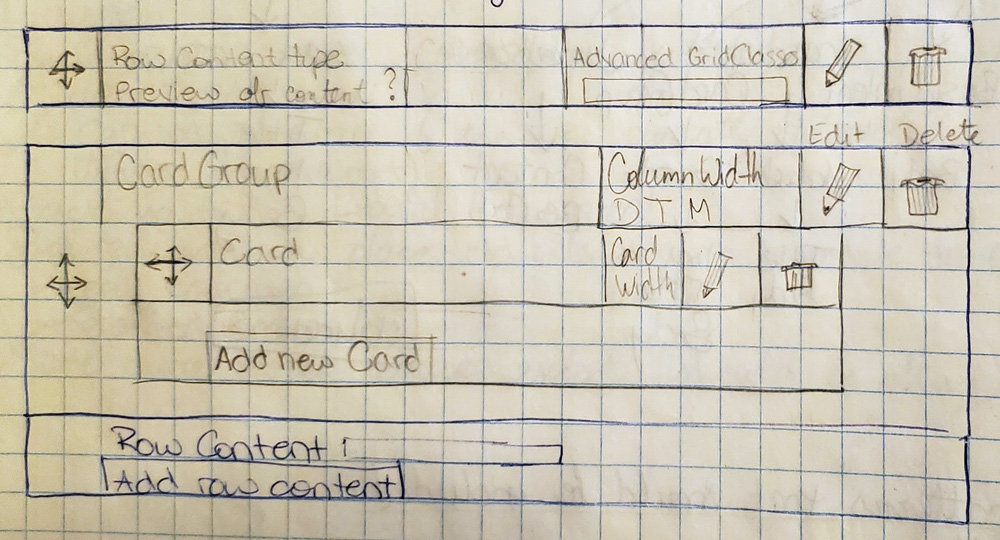
Components are usually sketched on paper, and then directly mocked up in HTML and CSS. Once I have a component ready to go, I send it to the developer who adapts it to work in Drupal.

Event links


Navigation
The main / side navigation is completely custom, built to be able to display deep menu structures. One of my inspirations for the side menu design was how reddit comments are displayed.


Component library
When I design a component for the website, I use both research and feedback from site editors to determine how to improve my designs. Everything is built to be universal across all sites, which reduces the amount of custom work the (small) web team has to maintain.
The main source for viewing web components is currently the public website.

Custom components
When a department requests a new component, I work with them to understand their needs, what the best solution is, and if the component can be constructed in a way that all departments would be able to use them.
Examples of custom components
Quote with image

Event link

Lightbox image gallery

UI improvements
I like finding small changes that can improve the user experience, in ways they don’t even see. The majority of the site editors do not have prior web knowledge or experience, and so I like helping make their lives as easy as possible.

Example: adding anchor in text editor
The default icon for adding an anchor in Drupal is… a flag? Surely there is a better icon that could be used.

Changing the icon to an actual anchor helps site editors recognize it faster.

Documentation
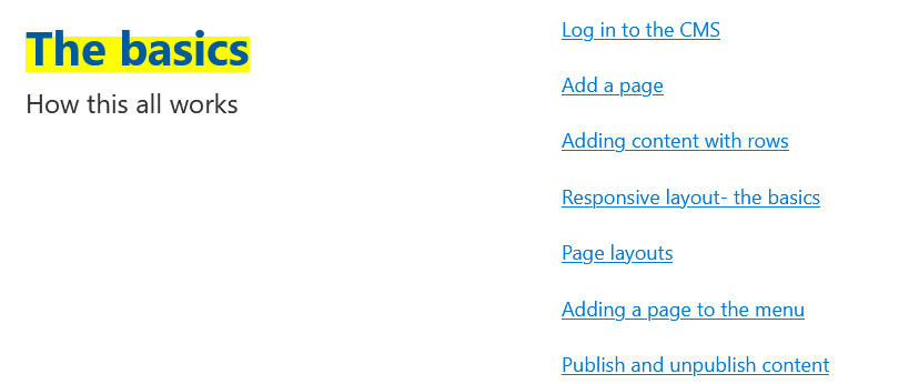
When the responsive theme was launched, I revamped our internal documentation. It is broken up into sections to make it easier to find what you are looking for, starting with the basics, using the text editor, and finally all of the components available. The components section includes the steps of how to use each component, but also explains what the component is, and when to use it. The latter part is typically what most site editors are the most unsure about.
I like to ensure that I am writing for a general audience who doesn’t know the ins-and-outs of how websites work.


Change log
When a new round of theme updates were designed during the Homepage Redesign Project, I started a change log so all site editors can see what is new.

Training
The majority of staff that update and maintain websites do not have formal web training, and so my team provides training sessions for how to use the CMS. My work with both the responsive theme and writing for the web has resulted in there being two levels of training:
- Basic training: Adding pages, using text editor, menus, introduction to responsive grid, common components.
- Advanced training: I provide more in-depth explanations of components. User experience and writing for web best practices are emphasized, and how to use good content and good design together.
This has been an excellent relationship-building process on campus, and I often consult staff when they are struggling to figure out how to organize the content on their page (and which components to use).
Future plans include breaking down the training process into short videos, to help both new and experienced staff whenever they would like a reminder of how something works.


