The Future Student website is where all university programs are listed, and helps future students understand what the University of Lethbridge has to offer. In 2020 a project began to move the site from a third-party vendor into the internally-maintained CMS and visual theme.
Instead of just moving the site look-for-look, I proposed that improvements should be made along the way after hearing a lot of feedback from groups across campus. A fun portion of this was redesigning the way programs are listed, and how they are filtered.
Note: There are no UX-specific staff at uLethbridge, and my passion for UX (along with a coworker) has made site redesign projects run differently, with great success. Web component redesigns on the public-facing website have started integrating more UX principles during my time here, especially ideation and getting early user feedback.
The old
- The program tiles are grouped by faculty by default, so some faculties get buried
- There’s an optical illusion in the tiles, where you see dots in the space intersections
- Filters were not helpful; a high school student doesn’t know what a “faculty” is
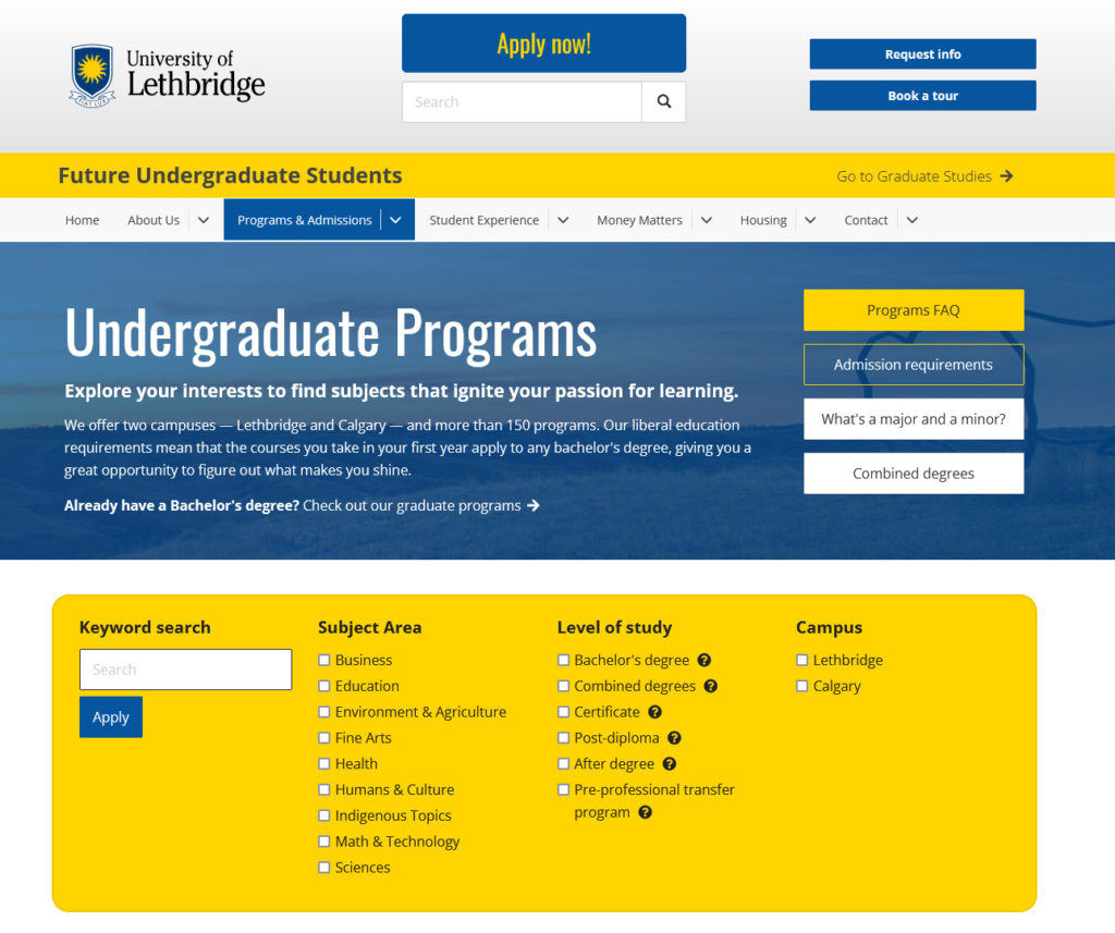
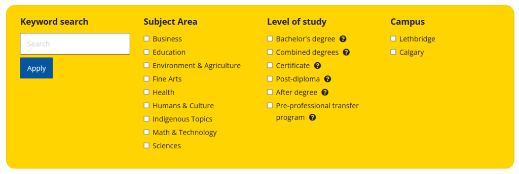
The new
- Alphabetized list of programs, simpler layout
- Adding useful content above the filters instead of a generic image
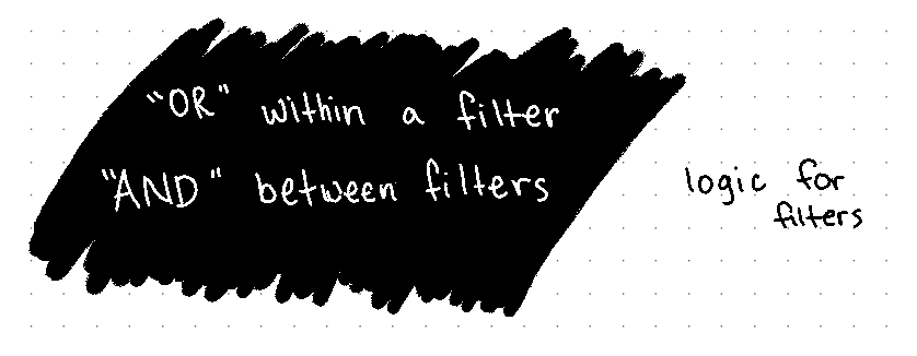
- Completely new sets of filters, validated with user feedback
Process
Research
- I talked to the creators of program pages and captured their frustrations with the old design (e.g. Faculty of Health Sciences always stuck at the bottom of the page by default).
- I talked to recruiters who use this site. The program filters typically didn’t work well when talking to students in high schools, and commented that students don’t know / care what a faculty is.
- Researched how other Canadian universities design / list all their programs, and what kind of filtering they use to ensure we are creating a pattern that is familiar to prospects who look at multiple schools before applying (spoilers: it’s all over the place).
- Researched best practices on how to make filters as user-friendly as possible, looking at how other industries use filters (e.g. e-commerce sites, portfolio sites)
Ideas
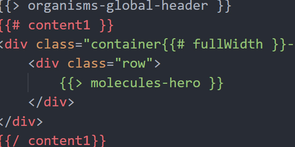
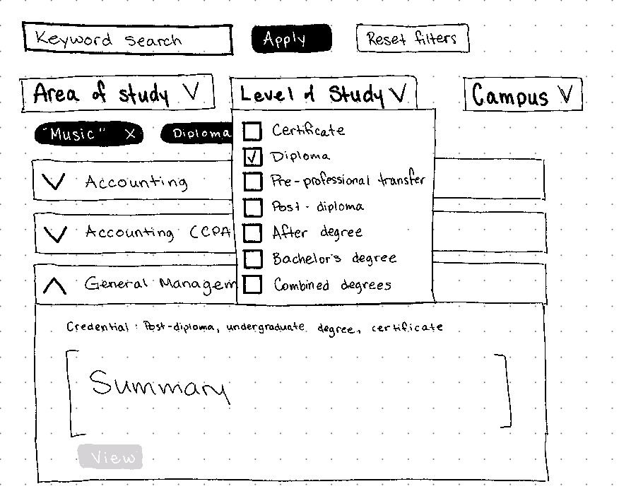
I designed a new filter component in HTML/CSS to pass along to the developer to start integrating / testing. There were small layout adjustments, but the style remained the same. In the meantime, I coordinated determining what filters to create.
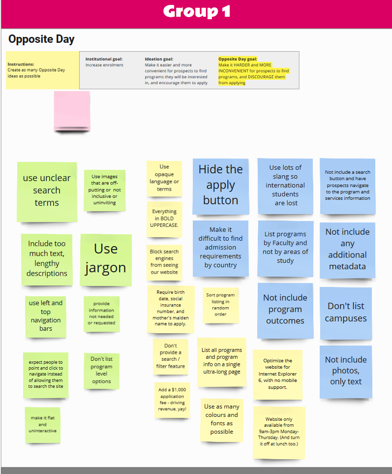
Ideation session: Opposite Day
How can we make finding projects harder?
- This involved everyone in the project, including the project sponsor, steering committee, project manager, developers, and the core working group.
- Groups came up with as many ideas as they could about how to make finding programs more difficult.
- It was everyone’s first time using Miro, so despite the learning curve everyone ended up having a lot of fun!
- Result: everyone was on the same page about what is important when finding programs on a website.
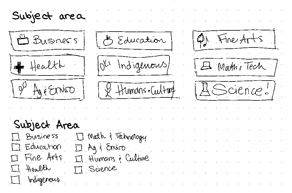
Whiteboarding session: Areas of study
- A common trend on post-secondary websites is to group programs into smaller buckets, which can be less intimidating when you’re looking for a program, or you’re not sure exactly what you’re looking for but have a general sense.
- I facilitated a whiteboarding session with all stakeholder groups in Miro to define ways that we could group programs
- Result: Identified certain consistent terms, and documented inconsistent terms that could be understood better by collecting user feedback
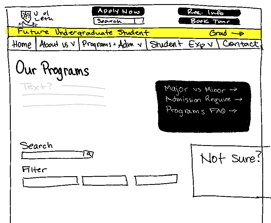
Sketches
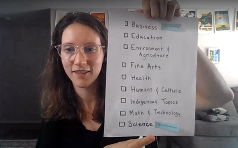
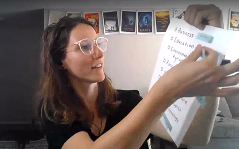
User feedback: areas of study
Instead of having internal staff decide how future students want to group programs, actual user feedback is key for understanding if this idea is valid, and if the labels make sense.
A hybrid interview / activity was set up:
- Interview: This helps us understand the audience, how they find programs, and what is easy or confusing. We asked if filters for specific areas would be helpful (without any prior indication that this is what we were actually looking for).
- Paper prototype: Fast, low-fidelity activities helped get fast feedback
- Two lists were created with different labels, and paper prototypes drawn up that simulated what they might look like as a filter
- Users were all asked where they would expect to find certain programs, using either List A or B
- Result: It was very clear that future students were very keen to have these filters, and some labels were understood much easier/faster than others.
Refine & go live
The final filter design was tested and approved, along with the updated content.
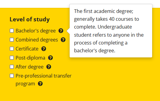
The “Level of Study” filter was also brand new, and this is terminology that high school students wouldn’t understand. Additional explanation was added beside the content.
The final result
The new program filters went live in September 2021, and early feedback has shown great engagement with the new filters. Adjusting the content above the filters also means the user doesn’t have to scroll as far to find information.