After Marie Kondo became popular, I realized how similar auditing a website is to organizing your closet; figure out what you have, and decide what is worth keeping.
Part of the site redesign process I go through with departments is how to complete a content audit, with a spreadsheet of information given to them. Unfortunately, the original inventory spreadsheet provided most certainly did not spark joy. It was difficult to know where to look for information, there was too much information, and it was difficult to maintain consistent language between multiple teammates working on it.
A content inventory that serves a department’s needs in a university context is very important. After stumbling through a couple of projects in an older format, I redesigned the spreadsheet so that it could be generated quicker, is easier to read, and is more intuitive to move through. While going through a site page by page can seem like a lot, the idea of getting to know all the content is exciting!

The original spreadsheet
There were 7 tabs, and it wasn’t clear which ones came pre-filled, and which ones the user filled out.

In reality, these were the only tabs that were being used:

It was also a nightmare very difficult to populate the spreadsheet before giving to the stakeholder.
The update process
The dream
A new spreadsheet is needed that is more user-friendly to help users (staff) make decisions for the pages on their site. The spreadsheet should also be way easier / faster to populate.
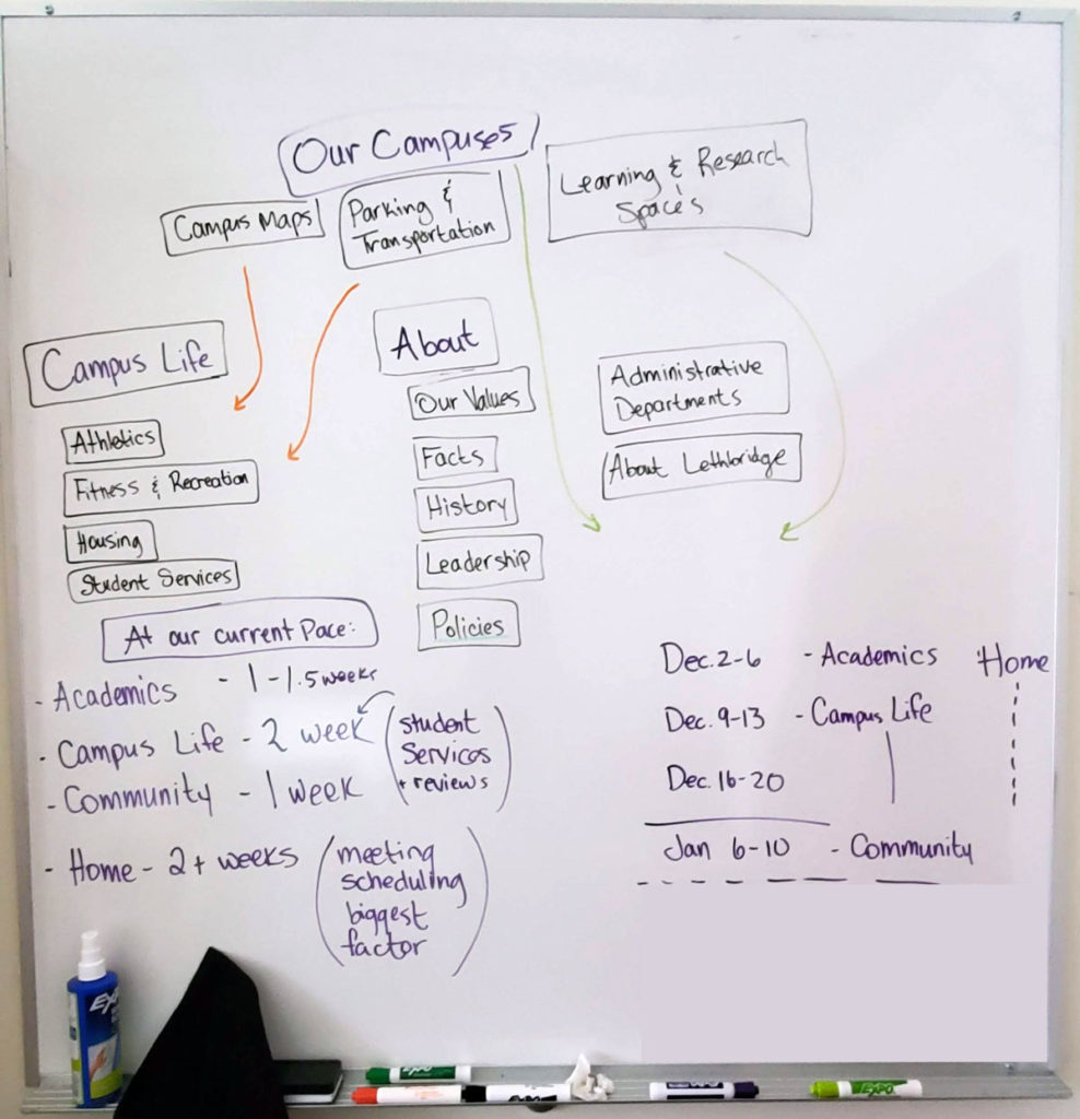
When a user goes through a content audit, there should be a flow for each page that makes sense:
- Pre-filled columns first, generated by the web team
- Empty columns after, to be filled out by the audit team
Ideas
I started by listing all of the columns that users have found useful in the past, and researching other content inventory templates. Descriptions were added so users didn’t need to rely on a reference document to interpret the purpose of that column.
I sorted columns into two groups:
- Pre-filled content should start general and get progressively more specific
- Empty columns should follow a similar pattern- understand the basics of the page, and then get into deeper analysis
Feedback
I worked with a colleague who has previous been a user (the one completing the content audit) to check if my initial idea was correct, and adjustments were made.
Build
Once the order of the pre-filled content was agreed upon, I worked with my colleagues on the web team to generate a report via the CMS (Drupal) that can spit out all of our data, in the order that we want it to. This means it should be a quick copy-paste into the new spreadsheet. I consulted with a manager that has excellent Excel-fu skills to help get the right pieces of data showing up in the right places, so there is no need to make sure Google Analytics data is in the same order as the inventory spreadsheet. Magic.
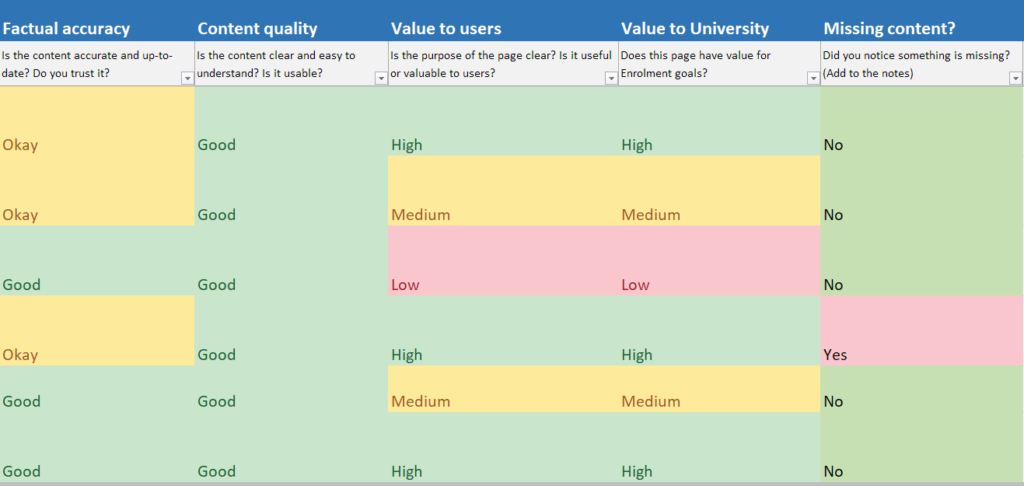
Preset dropdowns were added to certain fillable columns, to help make consistent language easier when multiple users are working on an audit together. The content of the dropdowns is customizable for each group. Everything is colour-coded so that you can see the quality of your site content at a glance.
I wrote documentation about how to audit content, including more details about each empty column they need to fill out. I also wrote internal documentation so that anyone on the web team can populate this.
The result
Please contact me if you would like to view the template for the content inventory spreadsheet
The new content inventory is:
- Faster to populate
- Easier to read
- Faster to audit, less time being lost, more time thinking about content
- Easy to see high/low quality at a glance

The hardest part:
Getting people excited to fill out a spreadsheet