The uLethbridge web team allows departments on campus to edit their own websites, and creates design components, technical training, and support when needed to over 100 separate websites. Some sites don’t get as much attention as others, and it can be difficult to work through a site overhaul on your own.
This website redesign process, the only project of its kind at uLethbridge, was in its infancy when I started working with the web team in 2017. I have improved it through research and experience so that it fits the needs of the department, gets them to their goals faster, and isn’t something that everyone dreads. The process evolves every time I guide a department through it, so it is always improving.
General process
While this is not anything new or innovative, the content redesign workflow has been introduced and implemented in several projects at the University:

Case study: uLethbridge home page redesign
2018-2020
University Communications needed a refresh of the group of pages seen at ulethbridge.ca, and I was a key player in the efforts to make this a reality. I brought knowledge about UX design, user research, information architecture, writing for the web, and designing web components, and also made sure that the writing style was kept consistent.
By following the site redesign process, the new home page had far fewer pages with content that could quickly become outdated, and was able to be maintained by a small team much easier.
Budget cuts and COVID-19 extended the length of the project, but we came out the other side with a website that better reflected the current brand, and new connections made across departments.
Live examples
Some of the tools used in the project
- Excel
- GatherContent
- HTML/CSS
- HotJar
- Illustrator
- OneNote
- Photoshop
- Resilient people
- SharePoint
- Microsoft Teams
- Adobe XD
- Whiteboards, sticky notes, cards
Highlights that made the project successful
Creating new connections across campus, building empathy
Communication was key to getting on the same page with Communications (go figure), and other departments on campus.
I took the time to understand the world that Communications lives in: the people, the workflows, even how their office space looks / operates. This helped us all approach the project on common ground, instead of making assumptions. Since our perceptions of websites were different, I developed a glossary to make sure we were speaking the same language.
Other groups were also connected as part of this process (including Recruitment and Admissions), and the relationship-building from this has paved the way for successful collaborations in future projects.
Gathering user feedback early in the process to understand how they think
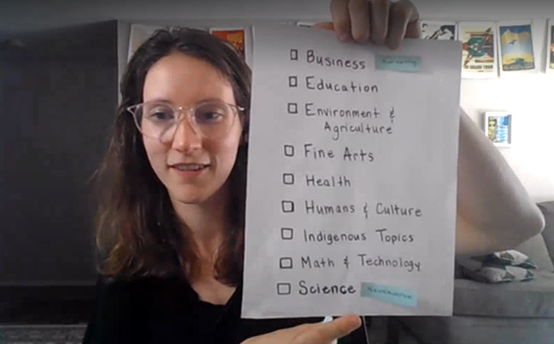
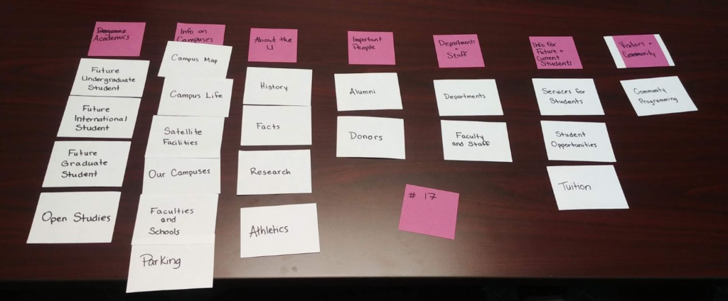
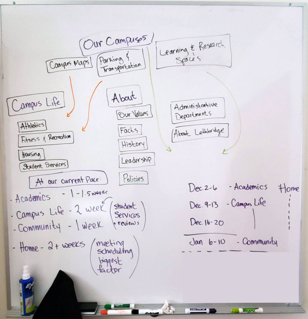
I made sure we had a clear understanding of our current audiences by… talking to them! A colleague and I will do blended user interview / card sorting exercises to understand how they think, and gather initial ideas on how we might group topics together.
Users who provided feedback included high school students, high school counsellors, parents, current students, prospective graduate students, and staff.
Collaborative writing process
Instead of just saying “You’re responsible for rewriting this content… go!” I helped facilitate collaborative content writing using GatherContent. There were many educational moments along the way, including writing for web, design patterns, user journeys, accessibility, and understanding how people read/use websites. This helped make sure the content writing process stayed on track with small corrections, instead of finding out they were way off course.
Launching improvements when they were ready, instead of all at once
We knew this project was going to take some time, so I encouraged smaller, iterative changes to be made as soon as they were ready. This included updating content and designs on related websites, such as the recruitment website, in order to improve the user experience.
Example: global header update
Fall 2019
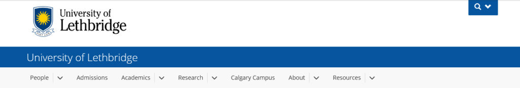
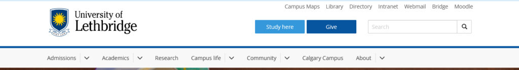
The global header on the website was not meeting user needs: all of the search / links were hidden, and there was no clear strategy about what links were included.
The global header update went through its own redesign process, including: discovery & research, ideation, prototypes, user feedback, refinement, launch
The result: a global header where all content is always visible, and new standards were created to set criteria for the links.
Improved mobile experience
I created the new global header component, including a completely new mobile experience. I was very mindful of how users would interact with the menu, and user feedback showed that it was easy to learn how to open/close/interact with the menu.
Coordinating & documenting a visual theme upgrade
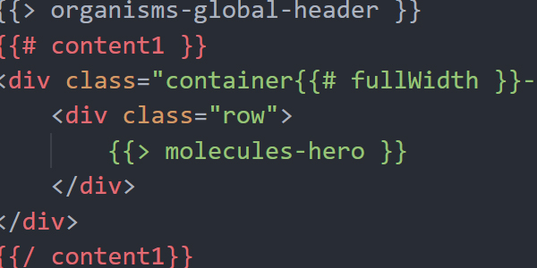
The homepage redesign project was the perfect opportunity to refresh the visual identity of the website. Designs were mocked up in Adobe XD and then translated into the code of our component library.
I also took the opportunity to improve other components so that they were more friendly for site admins to use. This included thinking about the priority of the types of content that go into a component. You don’t want to be thinking about text alignment on a hero image before you have the title and image added!
I also refreshed a large portion of our internal documentation to reflect these changes, which have provided so much more information and flexibility that site creators were asking for.
Planning & gathering feedback
This was the first time we distributed a beta version of the site, and captured feedback with HotJar. I translated this feedback into technical/content updates and sent it along to the right people (writers, developers, etc.).
A colleague also ran some virtual user feedback sessions (due to covid) with a list of common tasks, and the navigation was tested to make sure users could find their way around the site, and that labels made sense.
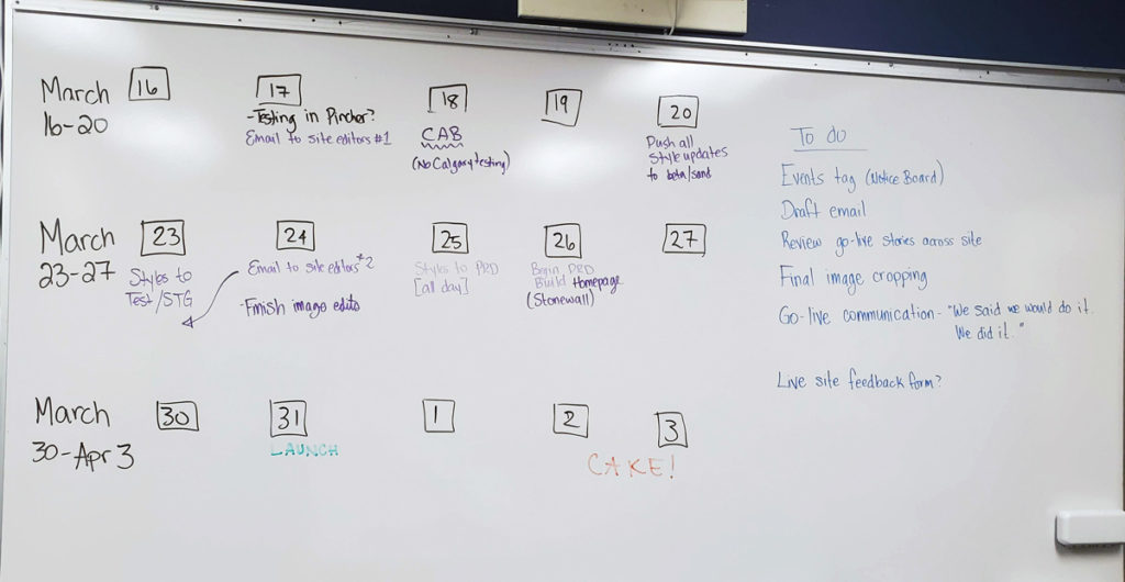
Coordinating the big launch
I like doing the little organize-y bits, including mapping redirects from old pages to new pages, making checklists of what tasks need to be done the week / day before / day of / after launch, and keeping everyone in the loop about where things are at.
We originally had a launch date of March 31, 2020, and I helped the team map out all the tasks that needed to be done, the order they needed to go in, how long they would take, and then assign them to actual dates. Unfortunately COVID happened around this time, and the launch was delayed until May.
The site launch was extremely smooth, with lots of positive feedback! The Communications team is now better equipped to write and maintain web content.
All departments that have gone through the content redesign process have had a much easier time maintaining their websites. Introducing user-focused thinking and gathering feedback from our actual users has shifted the culture on campus; more and more groups are prioritizing the needs of the user, instead of the needs of the department.