This was an independent study in my third year of my BFA. As my first ever dive into data visualization, I decided to tackle the data of music, focused around note playing and frequency. I have been a musician all of my life, and wanted to think about the data of the sheet music I play. For example:
How many more notes does a flute play in a piece than a tuba? What notes have already been played?
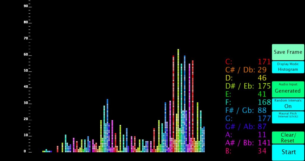
I decided to start small so I could learn the technology and begin my data viz journey. I made a visualization that took live input from a keyboard and created a histogram of the pitches played, all with a custom interface. For those that can’t play piano (like myself), a pseudo-random “song” could be generated. There was something very fun about watching the histogram be created!
See the feature in New Media Intersections: