As part of my data visualization internship with the Data Visualization Lab, we partnered with the Lethbridge Research Centre to bring data of perennial rye to life. Different varieties of perennial rye were grown across Canada over multiple years, with various bits of data collected.
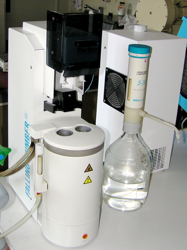
One measure of the grain quality is the Hagberg Falling Number. Rye flour is mixed with water in a test tube, and a plunger is inserted on top. The time it takes the plunger to fall to the bottom is recorded- the longer it takes, the better the quality. However, this measurement can only be done one or two samples at a time.
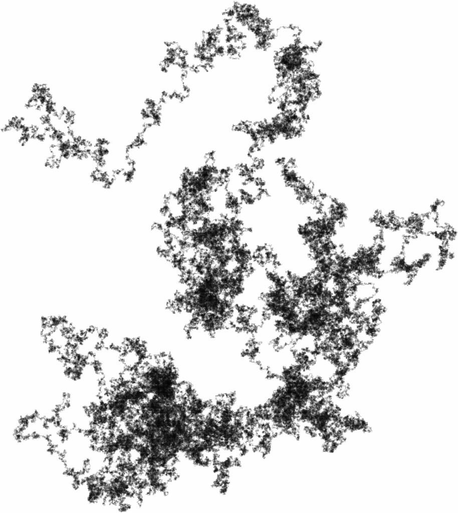
What if we could see all of the plungers falling at once?
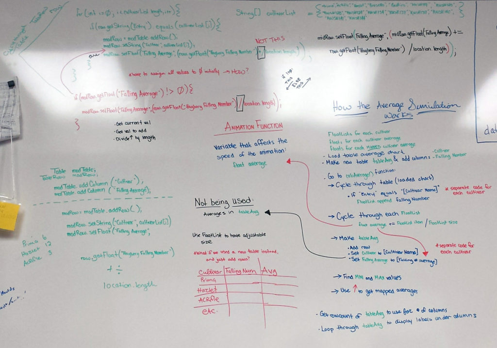
This visualization that shows exactly that, and all visual elements are generated based on the parameters of the input spreadsheet. The intent was for a researcher to be able to upload a new set of data, run the program, and be able to see their results (even if a different number of items were tested). While it’s no statistical analysis, it’s a very quick way to get to know the data. Who won the slow race? Which varieties were outliers, and how did they all compare to the average?