My second independent study in data visualization worked with data from the Lethbridge Research Station, focusing on how well a specific insect (the gall wasp) can curb the growth of two varieties of hawkweed, an invasive plant species in Canada. My project was also presented at the Plant Pathology Society of Alberta (PPSA) annual meeting on November 17, 2015.
First experiment: interactive bar chart
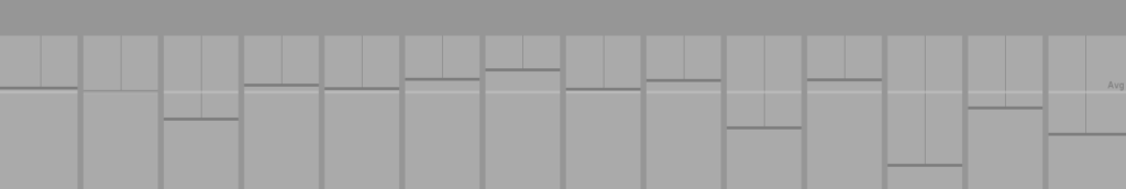
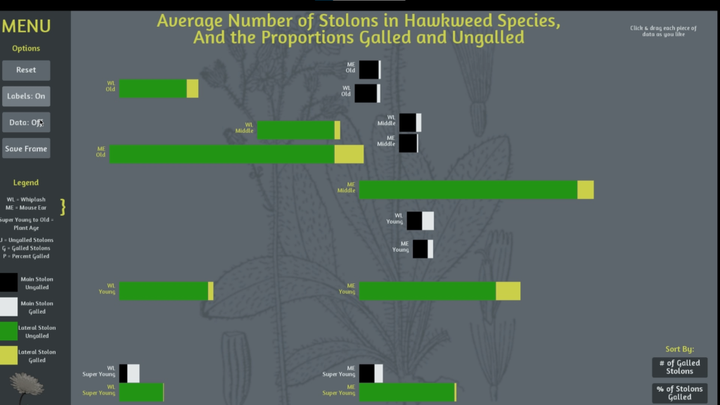
To translate numbers into visuals, I created an interactive piece that showed how much growth was affected by the wasp, compared to the growth of the entire plant.
Black and green bars were used to distinguish between two varieties of hawkweed in the research. The lighter colour on each bar represents the part of that plant that was affected by the gall wasps.
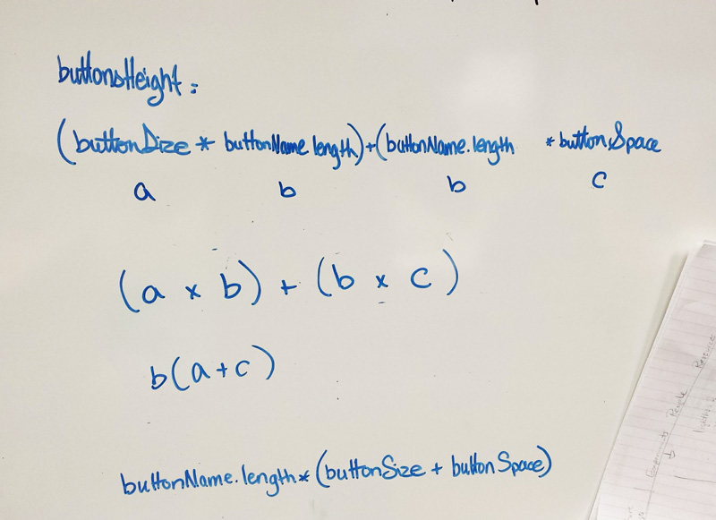
This project was a fun way to create an interface from scratch, and was coded in a way that reduced duplicate inputs. Even a bit of simple algebra made its way in:
Since all of the bars seem small in comparison to myself, its easy to glance at this and say
“So what?”
I decided to explore the scale of the data.
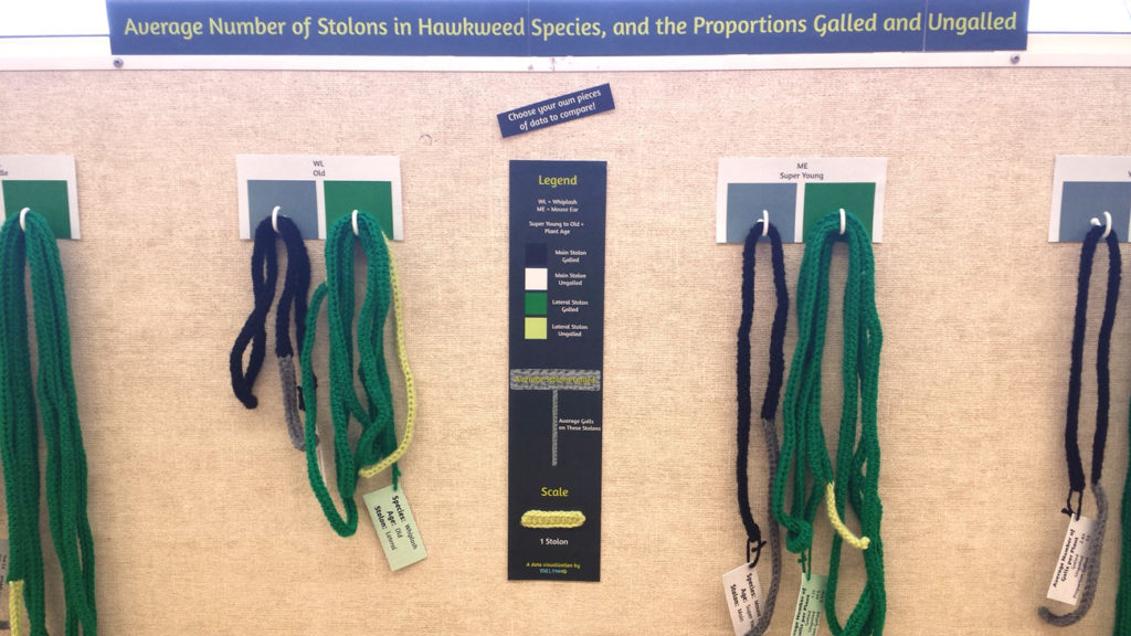
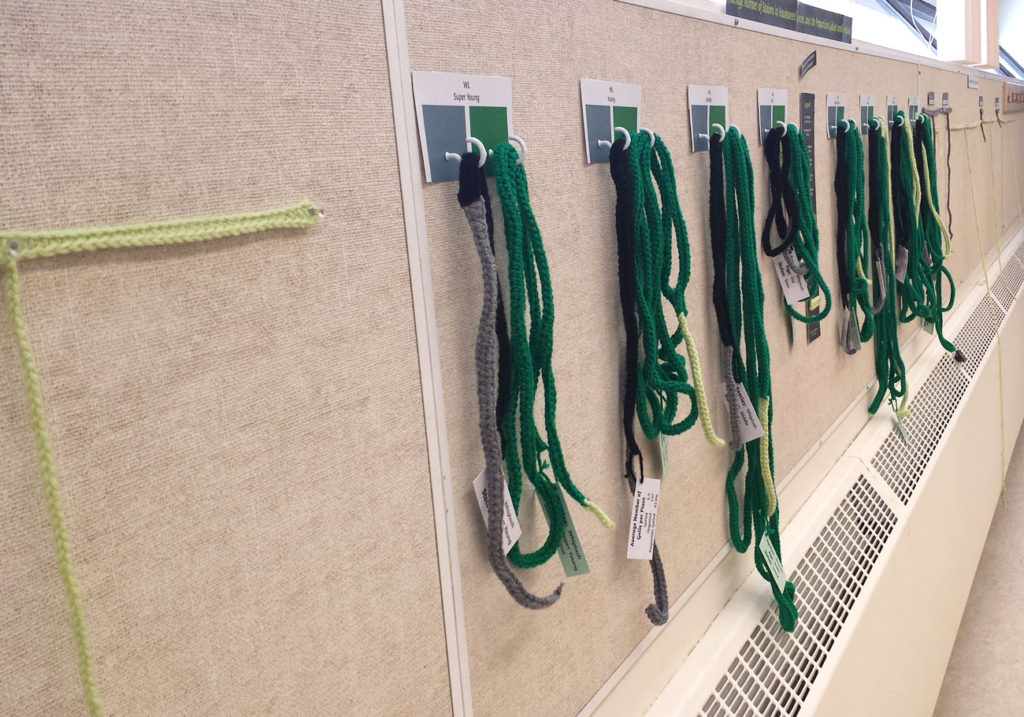
Second experiment: crochet bar graphs
I recreated the bars in the interactive visualization as long crocheted strips. Some strips were less than 2 feet long, while others were over 20 feet!
Each strip was hung on a hook, and part of the discovery was getting to stretch it out to see how long it was.
Putting things into a different scale compared to a human body was helpful in understanding just how much these plants grow and spread (and ultimately, how little the wasps slowed the growth).